This page currently refers only to this website (posthog.com). It will later be updated to also include information about app.posthog.com.
Logo
If you're looking for the PostHog logo, you came to the right place. Please keep the logo intact. SVG is always preferred as it will infinitely scale with no quality loss.
| Preview | Name | Vector | PNG | PNG w/ padding* |
|---|---|---|---|---|
| Standard logo | SVG | PNG | PNG @2x | PNG | PNG @2x | |
| Dark logo | SVG | PNG | PNG @2x | PNG | PNG @2x | |
| Light logo | SVG | PNG | PNG @2x | PNG | PNG @2x | |
| Logomark | SVG | PNG | PNG @2x | PNG | PNG @2x |
*PNGs with padding are useful when uploading the logo to a third-party service where there is limited control over padding/margin around the logo.
The @2x version of PNGs are designed for hi-dpi (or "Retina") screens. When using the logo in third party services that support uploading multiple versions (standard and hi-dpi), please be sure to include the @2x logo as it will appear crisper on newer devices, tablets and high resolution mobile devices.
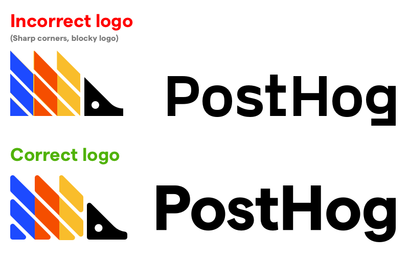
Important: We updated our logo in 2021. Please be sure to use the correct version. 👇🏼

If you have any questions or need clarification about which version to use, ask Cory, or reach out in the PostHog Users Slack and we'll be happy to help.
Typography
We use Displaay's typeface called Matter SQ. (SQ = square dots)
Building for web
On posthog.com, we use the variable font version. This allows us to specify our own font weights, which we do for paragraph text.
Context: Matter Regular's weight is 430 and the next step up is Matter Medium at 570, so we use our own weight of 475 for paragraph text.
Developing locally
Fonts are hosted outside of our posthog.com GitHub repo (due to licensing reasons). To protect the font files, they are restricted to loading on posthog.com and are not currently used for local development. Contributors will see the system default font load in place of Matter.
Workaround for local development
Restricted to PostHog employees, it's possible to reference the font locally to see an exact replication of what will be published on posthog.com.
Layout.scss contains some commented out code which can be used, in conjunction with the variable webfont files (restricted to PostHog organization members). Here's how to use them:
- Download the webfont files from the zip above
- Extract the files and place them in
/public/fonts - In
Layout.scss, comment out thesrcfor both fonts with production (Cloudfront) URLs and uncomment the relative URLs. - Optionally use
.gitignoreto keep the files locally without inadvertently checking them in
Note: When submitting a PR, be sure to revert changes made to Layout.scss
Designing on desktop
We use 4 cuts of Displaay's Matter SQ typeface (SQ stands for square dots):
- Bold (titles and section headers)
- Semibold (paragraphs accompanying headers and paragraph links)
- Regular & Regular Italic (paragraph text)
Note that Regular and Regular Italic are lighter than the font-weight we use on the web, so paragraph text in Figma mockups will look noticeably thinner than how it appears on posthog.com.
When designing ads or other content with non-paragraph text, use Semibold instead of Regular.
We have a handful of licenses for desktop use of Matter. Contact Cory if you need the desktop fonts (OTFs).
| Name | Weight | Size | Letter spacing | Line height |
|---|---|---|---|---|
| h1 | Bold | 64px | -1% | 100% |
| h2 | Bold | 48px | -1% | 120% |
| h3 | Bold | 30px | -2% | 140% |
| h4 | Bold | 24px | -2% | |
| h5 | Semibold | 20px | -2% | |
| h6 | Semibold | 16px | 0 | |
| Paragraphs accompanying large headers | Semibold | 20px | -1% | 125% |
| p | Regular | 17px | 175% | |
| p (small) | Regular | 15px | 150% |
Colors
We have two color schemes (light and dark mode), but primarily use light mode.
We use the same set of colors, and only swap out a couple hues depending on the color scheme.
Colors denoted with an asterisk (*) are the same between palettes.
| Name | Light mode | Dark mode |
|---|---|---|
| Text color (at 90% opacity) | ■ #151515 | ■ #EEEFE9 |
| Background color | ■ #EEEFE9 | ■ #151515 |
| Accent | ■ #E5E7E0 | ■ #2C2C2C |
| Dashed divider line | ■ #D0D1C9 | ■ #4B4B4B |
| Red* | ■ #F54E00 | |
| Yellow | ■ #DC9300 | ■ #F1A82C |
| Blue* | ■ #1D4AFF | |
| Gray* | ■ #BFBFBC | |
| Links | Use Red |
Use opacity over more colors
When possible, use opacity to modify colors. This allows us to use fewer colors in our palette, which is light years easier when working with two color schemes.
| Paragraph text | rgba($value, 90%) |
|---|---|
| Links | rgba($value, 95%) (and semibold) |
| Links:hover | rgba($value, 100%) (and semibold) |
Aesthetic
Buttons
Use fully rounded buttons and centered text.
| Name | Light color scheme | Dark color scheme |
|---|---|---|
| Primary | Background: ■ #151515 Text: ■ #EEEFE9 Border: 2px ■ #151515 | Background: ■ #EEEFE9 Text: ■ #151515 Border: 2px ■ #EEEFE9 |
| Secondary | Background: transparent Text: ■ #151515 Border: 2px #151515, 10% | Background: transparent Text: ■ #EEEFE9 Border: 2px ■ #EEEFE9, 10% |
Icons
Use filled in icons over outlined icons.
Presentations
We use Pitch for polished presentations (like when giving a talk). Read more about this in our communication guidelines.